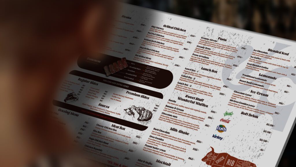
Fire & Forks is known as one of the first steakhouses in Mirpur. Their vision is to establish the business on national & global stages. Their mission is to provide quality & delicious Steaks and other items as well.
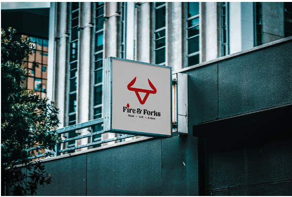
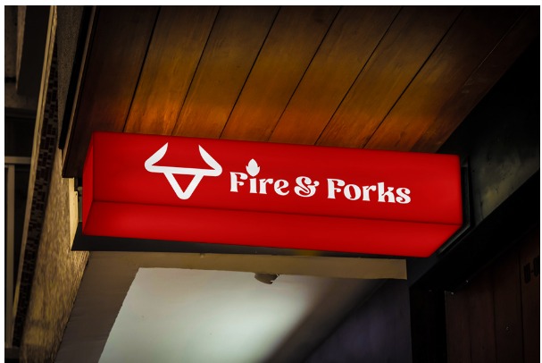
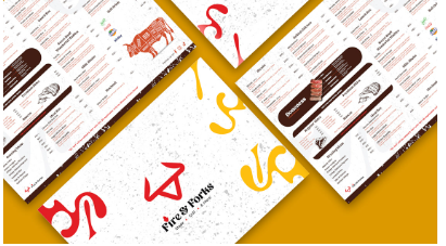
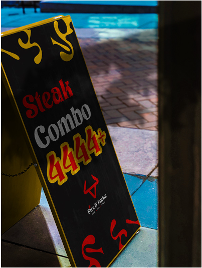
In designing the Identity for Fire & Forks, their old identity was pretty outdated and was not functional enough to use in many cases. The newly refreshed icon (THE RED HORN) is enough to resemble strongly and clearly who they are & what service they provide. The vibrant red was to showcase the love and passion for food and a unique pair of font to showcase the overall brand’s visual identity.